Using ggplot2 to visualize the frequency of your name!
How popular is your name?
I really liked this simple ggplot2 exercise from Jenna Eagleson that I stumbled across today. I’m going to reproduce it here, and I think it’s a useful exercise for students who are still learning the tidyverse and ggplot2 packages to play around with. I know I get bored with diamonds, and even palmerspenguins, so it’s good to throw something else into the mix to keep the learners’ minds engaged.
First Steps
We’ll be using just two packages today - so make sure you have both tidyverse and the babynames packages loaded up (and installed if this is the first time you’ve encountered them).
library(tidyverse)
library(babynames)
You might not be familiar with the babynames package, but it contains a very large data frame containing 1,924,665 entries of all names used at least five times from 1880 thru 2017. Here’s how Jenna describes it:
The
babynamespackage has a data frame provided by the Social Security Administration with: year, sex, name, n (number of instances), and prop (number of instances of given name and gender in that year divided by total applicants). Unfortunately, this data only has binary male/female as sex options. This data set includes every name with at least 5 instances!
Initial Plotting
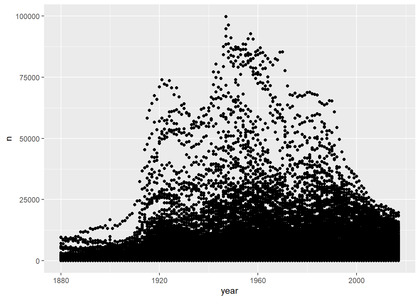
Our most basic plot takes all the names and plots them over time. Keep in mind that the dataset we’re working with is very large, so this plot might take a while to generate!
babynames %>%
  ggplot() +
  geom_point(mapping = aes(x = year, y = n))
But What About Your Name?
The babynames package lets us tease out specific names. For now, let’s assign your name and sex to some variables that we can then plug into the plot. I’ll use my info here, but replace with whatever combination of name and sex you are interested in!
myname <- "Ian"
mysex <- "M"
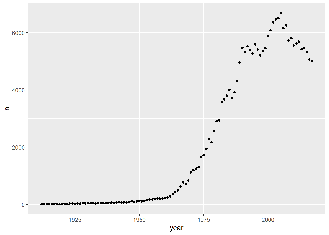
Now let’s create a plot using those parameters to see how common the name has been over time:
babynames %>%
  filter(name == myname, sex == mysex) %>%
  ggplot() +
  geom_point(mapping = aes(x = year, y = n))
There you go! I was born in 1978, so it looks like I got in on the name before it was too cool :)
Further Steps
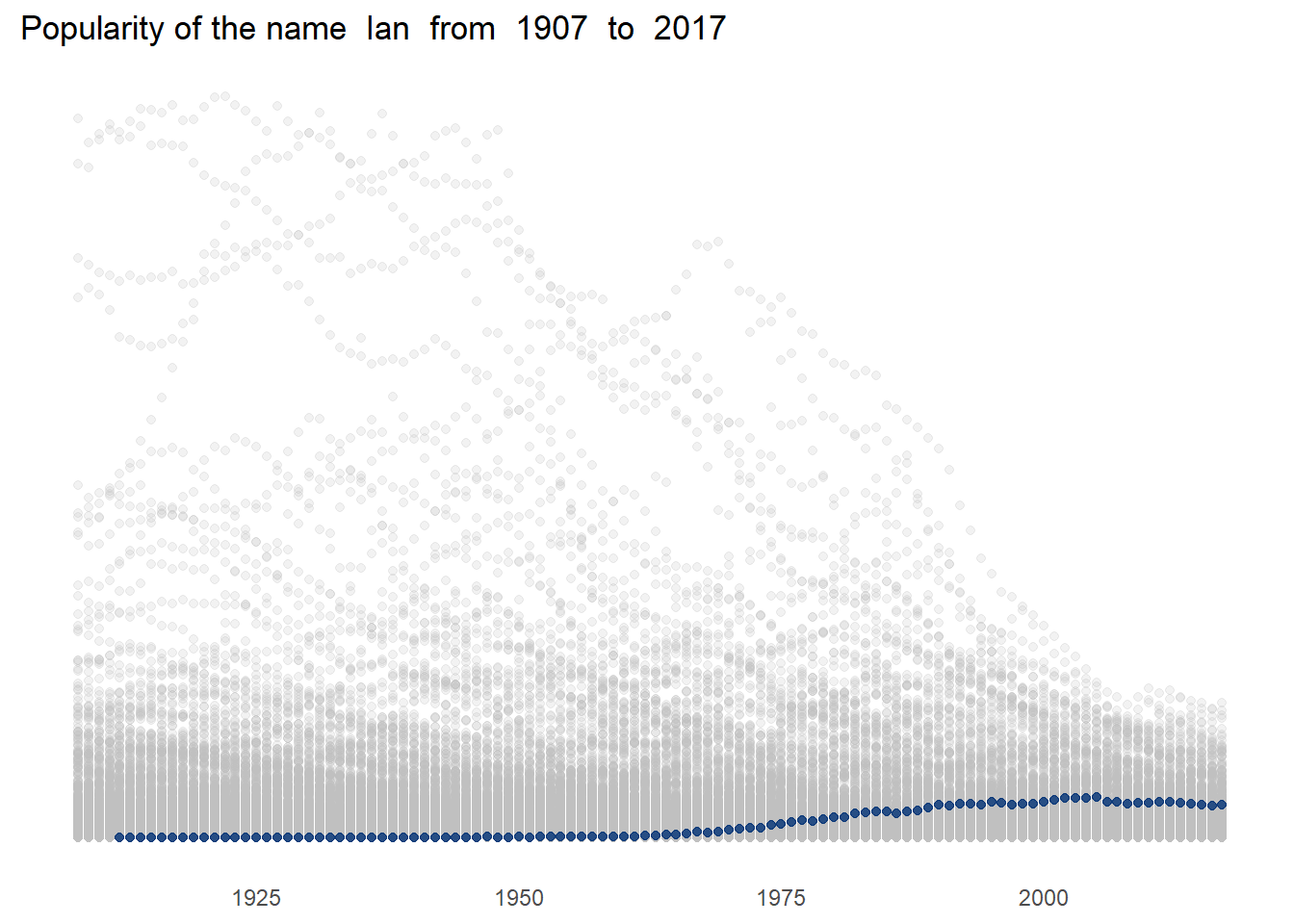
But what if I want to see the distribution of my name’s popularity plotted against all other names? Good question, and here’s one way to go about it:
mynameis <- "Ian"
mysexis <- "M"

myname <- babynames %>%
  filter(name == mynameis, sex == mysexis)

mynameminyear <- min(myname$year)-5
maxyear <- max(babynames$year)

babynames %>%
  filter(year > mynameminyear) %>%
  ggplot() +
  geom_point(mapping = aes(x = year, y = prop), alpha = 0.2, color = "gray") +
    geom_point(data = myname, mapping = aes(x = year, y = prop), alpha = 0.8, color = "#013175") +
# the below is just formatting, not required!
theme_minimal() +
 theme(panel.grid.major = element_blank(), panel.grid.minor = element_blank(), panel.background = element_blank(),
        axis.title = element_blank(),
        axis.text.y = element_blank(),
        axis.ticks.y = element_blank()) +
  ggtitle(paste("Popularity of the name ", mynameis, " from ", mynameminyear, " to ", maxyear))
Cool!
Cool!
Plotting Multiple Names
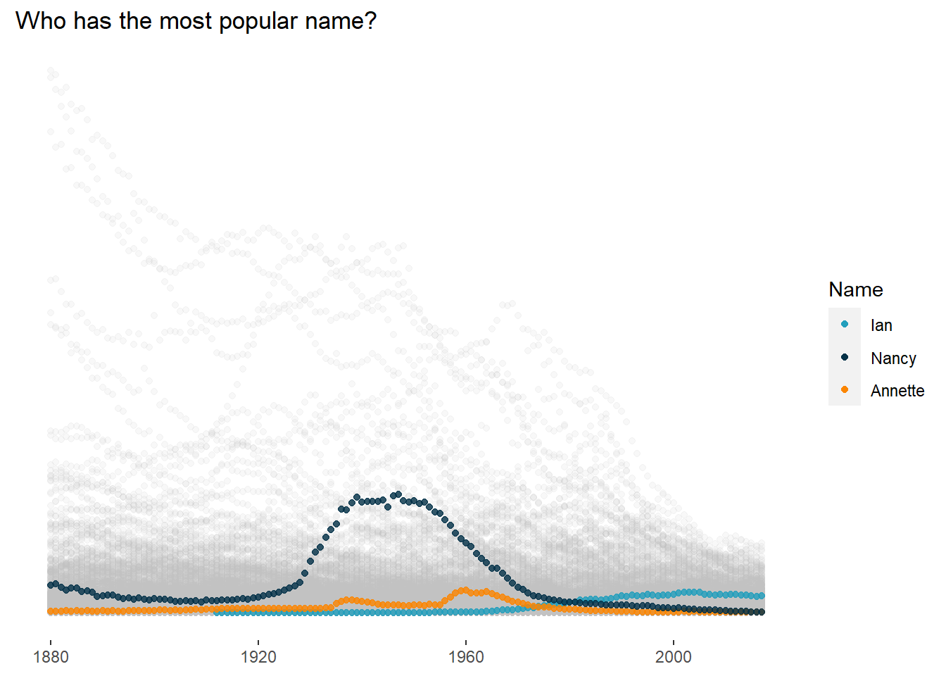
Maybe you want to compare names with your siblings or your children - easily done. In this example we’ll be comparing three names, but the example could be expanded to however many you want!
name_one <- "Ian"
sex_one <- "M"

name_two <- "Annette"
sex_two <- "F"

name_three <- "Nancy"
sex_three <- "F"
With the names set, now we can plot. You might start to see patterns to what we’ve been doing before. That’s good - one of the advantages of ggplot2 is that it brings a “grammar of graphics” to R, meaning we should be able to take separate pieces from different places and put them into new contexts.
firstname <- babynames %>%
  filter(name == name_one, sex == sex_one)

secondname <- babynames %>%
  filter(name == name_two, sex == sex_two)

thirdname <- babynames %>%
  filter(name == name_three, sex == sex_three)

legendcolors <- c("name_one" = "#219EBC", "name_two" = "#FB8500", "name_three" = "#023047")


babynames %>%
  ggplot() +
  geom_point(mapping = aes(x = year, y = prop), alpha = 0.1, color = "gray") +
  geom_point(data = firstname, mapping = aes(x = year, y = prop, color = "name_one"), alpha = 0.8) +
  geom_point(data = secondname, mapping = aes(x = year, y = prop, color = "name_two"), alpha = 0.8) +
  geom_point(data = thirdname, mapping = aes(x = year, y = prop, color = "name_three"), alpha = 0.8) +

# The below is formatting and not required!
theme(panel.grid.major = element_blank(), panel.grid.minor = element_blank(), panel.background = element_blank(),
        axis.title = element_blank(),
        axis.text.y = element_blank(),
        axis.ticks.y = element_blank()) +
  ggtitle(paste("Who has the most popular name?")) +
  scale_color_manual(name = "Name", values = legendcolors, labels = c("Ian", "Nancy", "Annette"))